
Project SummeryExchange VU - CAIDA
international exchange of scholars for software projects
(October 2000 - May 2001) My first assignment was to map reverse-traceroute[1] and looking glass servers [2] onto a world map. Using internet search engines and e-mails send by people maintaining reverse-traceroute and looking glass servers, I collected as many reverse-traceroute and looking glass pages as I could. Using their IP address and NetGeo[3] I could find their latitude and longitude as well as city, state and country. With this information I then used GeoPlot[4] to display the servers onto a world map.
The servers appear as little dots on the map and clicking on them will bring up a page containing the urls for the traceroute and looking glass servers for that node or zoom in to that particular region. The nodes are colored to indicate what services are available for that location.
Because these pages need to be maintained I wrote a program that will check if the pages in the database still exist and parse their contents to find out if the page provides traceroute and/or looking glass services. With the new database all the HTML-pages are generated/updated automatically. The next thing I did was to collect the AS numbers for all the traceroute and looking glass pages (again using NetGeo) and build a web page that allows users to search our database for traceroute and looking glass servers by AS number. This page also allows users to search by, AS-name, latitude, longitude, city, state, country, having a traceroute service and/or having a looking glass service.
The purpose of these pages is to give users with network problems the ability to find the nearest traceroute/looking glass service in a convenient way based on the location they desire to trace from. The traceroute/looking glass services can then be used to view their own network and can provide hints to what causes their networking problem.
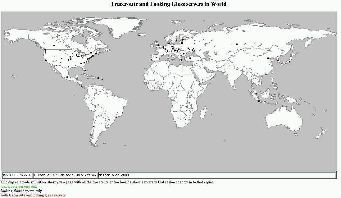
Image of worldview. Larger 1098 x 637
The second assignment was to update the web pages that provide users with daily summaries of data collected by the skitter boxes around the world. I first had to familiarize myself with the way the scripts currently processed the data for web usage before I was able to expand their web pages. In particular, I added pie charts to display the percentage of paths going through a particular country or AS. Because a user can select multiple skitter boxes and dates to generate this pie chart, I had to merge the data of the skitter boxes and dates before I could generate the pie charts. I first implemented this task in Perl, but due to speed limitations I ported it to C (for 50X speed improvement).
The selection of dates and servers from the web page was not very user friendly because not all servers had valid data for all days. The user had to consult a list of servers next to each date to see if a particular server had data for that date. Using Javascript, I changed the selection part so that when the users selects a given skitter box, the date menu is updated to contain only those dates that that skitter box has data. Conversely, clicking on a date will trigger the server menu to only list those servers with data available for the selected date(s). It was incredibly tediously difficult to get this functionality to work for most browsers/platforms out there.
I also added AS connectivity graph images to the web pages. An AS graph image shows a graph with AS nodes arranged in a circle with polar coordinates, with their angle based on the location of their AS headquarters and their distance from the center reflecting the richness of their observed connectivity to other ASes. Those nodes closest to the center are the most connected ASes as observed for those particular days and skitter boxes. The graph is drawn by a visualization tool called Otter [5]. Users can download a data file for Otter that allows the user to view the graph on their own machine with more detail.
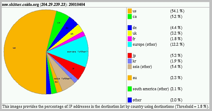
Image of pie chart. Larger, 724 x 379
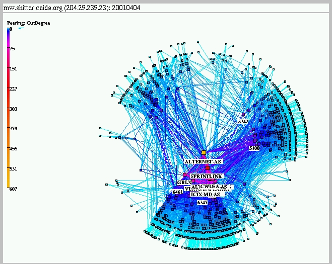
Image of AS connectivity graph. Larger, 659 x 525
The third assignment was to update the Otter network mapping/visualization tool so it has arrows at the end of the links between nodes to indicate the direction of the link. We would want to print the arrows too, which required more understanding how PostScript works, since Otter saves images in PostScript format. After this, I implemented the arrangement of the links entering or leaving the node. Instead of all links merging in the center of the node, the lines are now spread out over the 4 sides (a node is displayed as a square) depending on the location of the other node it is connected to. Links are also sorted by up/down or left/right to the same node. Of course a lot of time was spent to understand how Otter worked but afterwards I was also able to improve the stability of Otter.
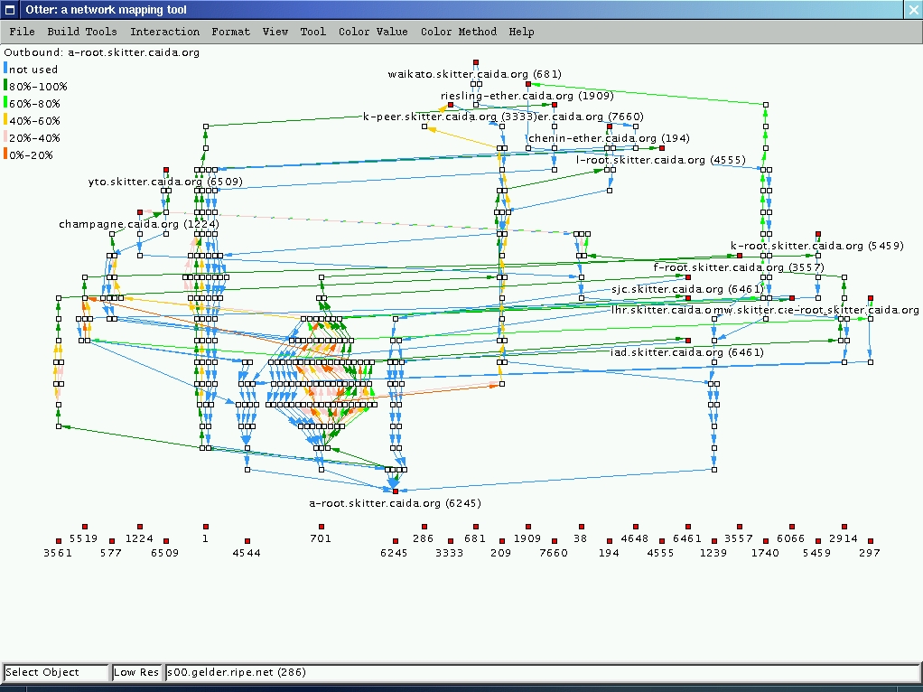
Image of Otter. Larger, 1022 x 766
The final assignment, which I was not be able to finish because of time, was generating animations of AS Graph images for particular servers and days aggregrated over a particular number of days. I used Otter for the generation of the graphs. Otter will use the maximum size of a page when it's printing to file. For animations this is not preferrable because the images will vary in size and common nodes between frames will jump over the screen. So we define four anchor points in every frame with the minimum value set to the minimum outdegree found in all frames. After this we normalize all outdegrees to be a percentage of the maximum outdegree found in all frames.
We extended the program to use only a limited number of nodes in the animation to improve visibility of the most connected nodes. After doing a day-by-day animation for 364 days in 2000, the nodes were still jumping a little. The way to solve this problem is to generate intermediate frames that smooth out the movement of the nodes between frames. This is not yet implemented because of time constraints.
Very interesting are the Animations which show web dynamics.
| [1] | Traceroute servers allow the user to traceroute from the server's perspective. The user can see the return path from that server to their own machine or to other machines. See ReverseTrace |
|---|---|
| [2] | Looking glass servers allow the users to see the BGP tables at that particular point in the internet. See ReverseTrace |
| [3] | NetGeo uses 'whois' records to determine the location given a domain name. See NetGeo. |
| [4] | Geoplot is a light-weight java applet which allows users to create a geographical image of a data set. See GeoPlot |
| [5] | Otter is a tool used for visualizing arbitrary network data that can be expressed as a set of nodes, links or paths. See Otter. |